
Vittorio Longo, Sr Marketing Designer
That's Vittorio Longo, Sr Marketing Designer at wamo, on what keeps his work exciting: real ownership, and room to experiment. The same thinking shapes how he approaches fintech design. "Trust doesn't have to mean conservative or boring." Fintech brands, he believes, don't all need to look the same just because they deal with money. A brand can be bold, distinctive and even a little playful, as long as it stays clear, consistent and honest. Finding that balance is the heart of his work.
Making wamo Easy to See and Trust
Ask Vittorio to explain his job to someone who's never worked with a design team, and he describes it as turning what wamo stands for into something people can see, understand and trust. That covers the website and campaigns, right down to the small details that help customers feel confident using a product.
The goal is never just to make things look good. "We're designing to make financial services feel simpler, more accessible and more human." When people choose a financial partner, they're trusting it with something fundamental to their lives, so every design decision needs a purpose. Ideally, customers shouldn't have to work hard to understand what wamo offers or why it's the right partner for their business.
Connecting the Dots
For Vittorio, being multidisciplinary means seeing a brand as a whole rather than a string of separate assets. A landing page in the morning, a campaign concept in the afternoon, an email journey the next day: each has its own constraints, but all of them should add up to the same brand experience. "A great campaign can attract attention, but the landing page needs to deliver on its promise." What he loves most is following an idea from the first concept all the way to how it performs in the real world.
Audiences differ, he says, in their expectations, cultural references and relationship with financial services, so a campaign can't simply be translated. The principles stay the same, while the expression adapts. "The goal isn't to make every market look identical, but to make every market feel like it's experiencing the wamo brand in a way that's relevant to them."
A Campaign With a Human Face
That philosophy came to life in wamo's first brand campaign in Finland, created with Petri Kontiola, former Finnish national ice hockey player and Olympic medallist. The campaign was built around the relationship between a business and the partner it can rely on, which gave the team a recognisable character and a way to tell stories with humour. Vittorio helped shape the creative direction and made sure the idea could live across formats, digital billboards included.
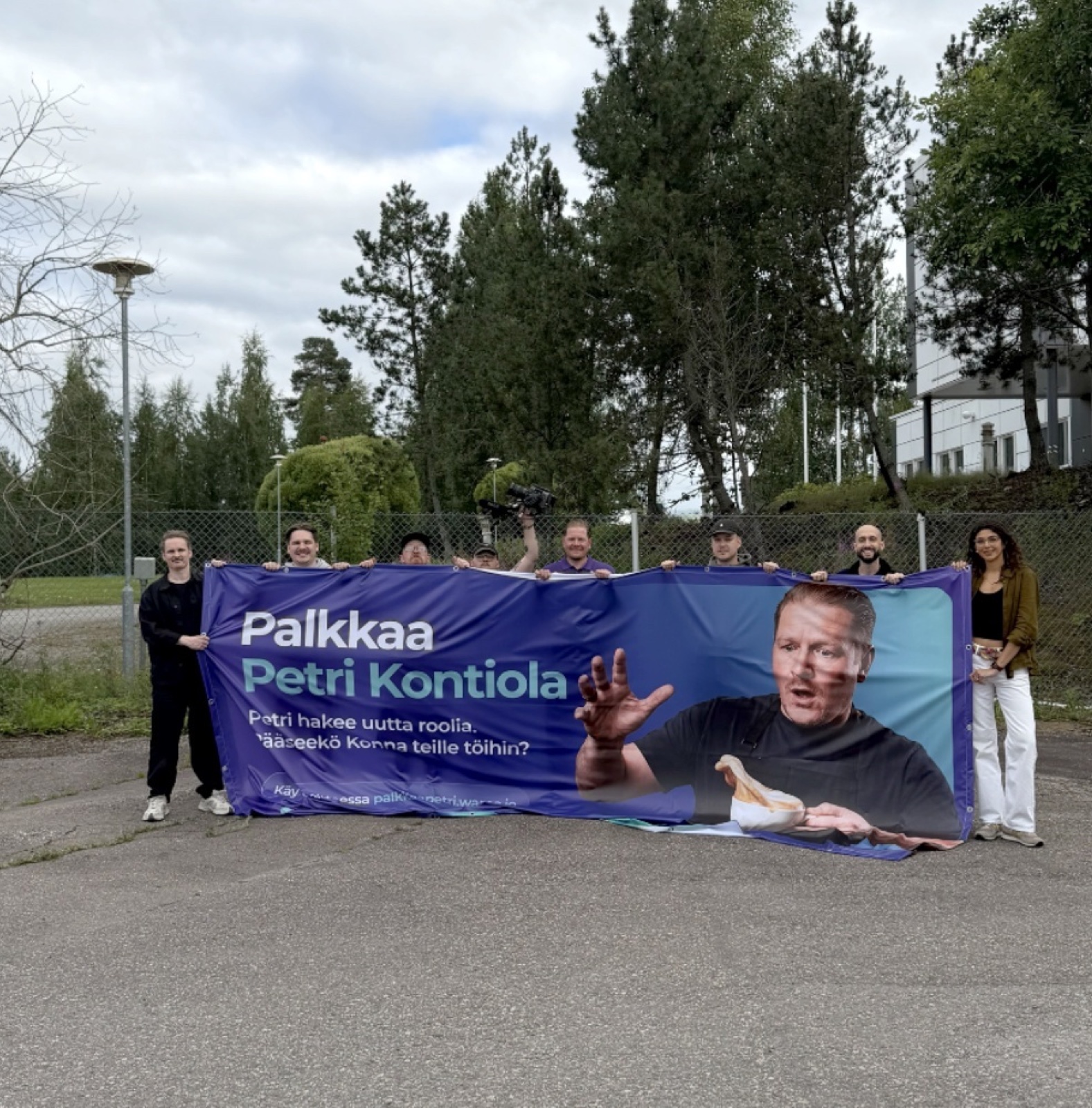
What he's proudest of is giving a functional product category an emotional, culturally relevant angle. "We weren't just talking about what wamo does, but showing the role we want to play in a business owner's life. And humour was our way of making it memorable."
A Designer's Eye, Still Essential
Vittorio sees AI as a way to expand what's possible, not a replacement for creative thinking. He uses it to explore visual directions, test concepts and create imagery that would otherwise cost far more time or money. He adds that a designer still has to judge what to keep, what to reject and how to art direct the result. "The real value isn't in producing more, but in using these tools to produce better work."
He applies the same judgement to trends. He looks well beyond fintech for ideas, from advertising and photography to culture and technology, but a trend has to help wamo communicate more clearly, become more recognisable or stand out meaningfully. "Trends can be useful ingredients, but they shouldn't become the identity itself."
Room to Lead
What Vittorio enjoys most about wamo is the chance to have real, visible impact. In a company growing this fast, design is closely tied to how wamo reaches new audiences and builds the business. That gives him room to lead beyond individual deliverables: challenging an approach that no longer serves the brand, introducing a better way of working, or spotting an opportunity no one has explored yet. "I thrive on that mix of ownership and experimentation."
If wamo Were a Font
Asked which font wamo would be, Vittorio picks Google Sans. "It's modern and confident, but it doesn't take itself too seriously. There's something quite human about its shapes. It feels approachable without losing clarity or credibility." Most of all, he says, it isn't trying to impress anyone with how complicated it is, which sounds a lot like the brand he's helping build.